Saturday, July 24, 2010

Module 10 Maps


These maps were created during the Week 10 Homeland Security exercise. The exercises involved helping secure NORAD. The first to maps (above) were pretty straight forward. I had trouble with the last two maps with the line of site. Particularly in arc scene where nothing seemed to line up that great. This is probably due to the lack of practice in arc scene. I found the concept of the line of site to be very fascinating.

Wednesday, July 7, 2010

Module 8 - Graduate Map


I had issues with bringing all the juvenile crimes into my map. Judging from the few that made it into the map, it would appear that the 1000 ft. drug free zone is effective. A small percentage of total schools had juvenile criminal events in the drug free zone.

Tuesday, June 22, 2010

Week 6: Alachua County Home Location


The above maps were created while completing the Week 6 module. It shows the outputs of choosing a home location based on several factors. The toughest part of this assignment was keeping all the maps and data straight. I found the overlay process very interesting. My two outputs for the even and uneven overlays were very similar. The best tracts from the overlays were identical. I think this is because using so many factors caused the output to vary little.

Sunday, June 13, 2010

Week 4 Participation Activity

GIS in today's world plays a major role in disaster response and recovery. The first thing GIS can do after a disaster is create an understanding of what happened and what is continuing to happen. Without this knowledge, any attempts to respond and recover would be misguided and ineffective. Once an understanding of the scope and drivers of the disaster are attained, GIS can begin to target where and how help can be allocated effectively.

The decisions that GIS can help make are varied. They can include where to boom for an oil spill or where to set up health and government aid centers for the affected population. GIS can allow emergency managers to be very specific in their response. Good data can provide cultural and demographic insite to affected areas. This means such things as language barriers can be identified before responders move in, allowing for the correct personnel to be directed to areas they would be most effective.

As the disaster response and recovery moves on, GIS can be a great tool to keep the public informed. The general public will want to know what is being done to to help their community recover from a disaster. No communication between the recovery effort and the public can lead to tension and mistrust. Allowing the public to see maps that communicate how the disaster response and recovery are being handled can go a long way to ease public tension and curiosity. Being able to visually communicate to residents of an area whats going on is the best way to put efforts in perspective that they will understand. This can open up a channel of communication that may lead to constructive feedback from people who know the area the best and open up possible solutions previously unknown.

The clean up efforts in a disaster can become a long and tedious process. GIS is a great tool for making clean ups efficient and effective. Standing on the outside looking in, a disaster area be overwhelming. GIS allows responders to identify what, where and how to deploy assets that would not be so apparent from ground level.


The Deepwater Horizon oil spill has brought a heavy dose of GIS into the response and recovery. Since the explosion and oil leak began, GIS has been used to assess the oil spill and the subsequent response and recovery.

At the beginning of this disaster, GIS aided in tracking and calculating the sized of the spill through aerial imagery. This allowed for assets such as boats with booms to be properly positioned to block as much oil as possible.

Once it became clear that the oil would be flowing from the well for a long period of time, preparations needed to be made to protect the coasts from the oil. Maps using aerial photography, wind and current models were used to show the project oil path. This allowed local, state and federal officials to determine where and what protection would be most efficient in combating the oil. This would include where to locate booms and where to set up staging areas for such things as animal recovery and cleaning efforts.

Since the oil spill is so far out in the Gulf of Mexico, the general public only understands the scope of the disaster through maps we see on the internet and television. GIS has been a great help in visualizing where the oil is and who will be affected. This has an economic component as well. The gulf region's economy is driven in a big part by tourism. Places like northwest Florida rely on tourists to visit the area. Using maps that communicate that their beaches are not yet greatly affected by the oil spill can help in bringing in tourists who may stay away completely. The businesses who suffered economic loss such as resorts and fisherman will surely be seeking financial compensation from BP. GIS will play an important role in assessing what they are entitled to with factors such as proximity to oil spill.

Clean up efforts will be driven by GIS. Maps will show where crews should be placed and what type environment they will be working in. GIS will also allow for wildlife workers to identify areas most inhabited by certain animals. GIS will help them locate areas to release treated animals to insure they are in the safest environment possible.

Saturday, June 12, 2010

Module 5: Urban Planning


The above maps were created from Module 5: Urban Planning. This exercise helped me understand methods used in analysing land in different ways in the urban environment. I also picked up how to apply an automatic layout for maps which will come in handy in the future.

Wednesday, June 9, 2010

Module 4: Project 2 - ESI Maps


Add Image


The above maps were created in response to the Deepwater Horizon oil spill. They show environmental and economic sensitivity to this disaster. These maps can be used to mitigate possible damage by the oil by identifying who is in charge and what areas are most important to protect.
The most at risk areas include marshes and swamps. Out of the 63 miles of shoreline, 14 miles fall within the ESI rating of 10, being the most sensitive. The areas will be harder to clean up and have to endure the greatest impact of the oil.
The federal government is in charge of a large portion of the coast represented. The state government has a smaller area of authority. There are still a many areas which are not defined on who would have authority.
Regarding boom, 3600 ft. with many more ft. proposed and planned. The boom is and will be placed strategically to protect the most sensitive shorelines.
Birds, Terrestrial Mammals, Invertebrates and Reptiles are sensitive creatures in the map area. It seems the invertebrates will be affected the most by the oil as they inhabit all waters. They will have the least protection and would be virtually impossible to have a catch, clean and release program.
Tourism is a main economic driver for this region. As the map shows, there are many recreational beaches that draw tourists every year. There also many marinas that are home charter fishing boats. With oil affecting the area, fishing will be off limits or perceived as off limit, impacting the local economy in a negative way.
I would like to have done more in the way of graphs and tables, but this week's projects took a great deal of time. It was interesting working on a project that hit so close to home and is still ongoing.


Tuesday, June 1, 2010

Module2: Project 2


The flooding in Key West related to Hurricane Wilma is great. The above maps show nearly all important infrastructure affected by the storm surge. With the amount of infrastructure in need of repair, I would recommend hospitals and airports be the first priority. This will help treat the sick and injured and expedite the flow of aid into Key West. The second priority should be schools and churches were shelters and staging areas can be prepared.


Regarding the types of land affected, developed land has overwhelmingly been flooded. It accounts for 69.9 % of the flooded land. The developed land is also evenly distributed around the island, not just concentrated in one area.
The issues I had in this project were the disappearance of a couple of islands during the process. I am now left with a few places label without land. There was some discussion about this in elearning but did not have time to get to the bottom of this.


Sunday, May 30, 2010

Module 2: Project 1


The above map shows infrastructure and hospitals in danger of damage by flood waters from Hurricane Katrina on the Mississippi coast. An interesting part of this exercise was to see just how many symbols there are in ArcMap. I also thought the technique to get the areas flooded was interesting. I have had trouble with some of my jpegs having all the outer lines showing up once exported. It is a pain to try to fix this when the servers are slow.


The map above shows the types of land cover flooded by storm surge from Hurricane Katrina on the Mississippi gulf coast. I believe the hardest part in making this map was the reclassifying of values because it's easy to make a mistake doing that.


Monday, April 5, 2010

Week 11: Labels, Spatial Analysis & 3D Analysis


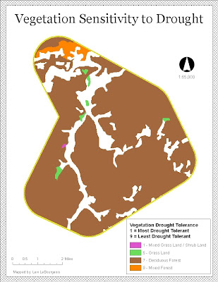
The above map shows vegetation drought tolerance for a chosen study area. It was created in an exercise to learn how to reclassify data to a common scale.


The above 3D map shows data for the Mt. Shavano area, which is located in south-central Colorado. The yellow line indicates a hiking trail that runs through the area.


Sunday, March 28, 2010

Spring Break Lab: Gulf County Acreage


The above map shows the top four acreage owners in Gulf County, FL. I did not encounter too much trouble with the lab instructions. I found the process of summing the acreage interesting and something I'm sure I will use in the future.

Friday, March 19, 2010

Week 9: Vector Analysis 2


The above map was created following instructions for the Week 9: Vector Analysis 2 lab. It shows the possible campgrounds for a state a park that meets the criteria outlined in the lab exercise. I enjoyed this lab and I believe the skills learned in this lab will no doubt be used again.
Lab Answers:
1. I used the intersect tool. I did not see a noticeable difference between the union and intersect files.
2. I used the erase tool. I used this tool because I knew it would allow me to erase the conservation areas and would leave me with only possible areas for the campground.
3. 79 features are present in this layer. The largest feature is 7,765,034 square meters while the smallest is 5,656 square meters.

Wednesday, March 3, 2010

Week 7: Data Editing Lab


The above map was created for the Week 7: Data Editing Lab. This lab was one of the quickest yet. I did not have many issues in this lab. I enjoyed learning the process of how to create a new shape file. I did find it challenging following the ERSI steps and plan on reviewing them this week.

Monday, February 22, 2010

Week 6: Georeferencing Tools


The above map shows the University of West Florida campus. It was created following the instructions for the week 6 lab. This may be my favorite lab so far. It was interesting learning how to georeference the layers to make them fit. I found it interesting that when working on the south layer, when I added one more link, it moved the RMS error from 12 to 15. The map looked better after so I left it. I did not have any real issues during this lab.

Sunday, February 21, 2010

Week 5: Data Search


The maps above were created using the instructions for the week 5 lab. I divided the maps into three. I thought the land cover and hydrology map had so much stuff going on, it would be best not to add anything else. The cities, roads and public lands map came out nice. I would like to have played with the font and labels a little more but the Arc Desktop was running painfully slow this weekend which left me no time for tweaking little things here and there. That brings me to the raster data set map. This map did not come out how I would have liked. With arc map and catalog running so slow, I was lucky to get the three areas on the map together. I had no problem using the DEM conversion tool, but projecting these data sets as I wanted was taking three hours each and then freezing up the desktop. I contacted the help desk but I don't know how much help that was on the weekend as I am yet to get any response. In fairness to them, I probably sent the message st 3:00 am (one of many long nights on this lab). This was a frustrating lab, but I did learn alot. I actually enjoyed learning and executing the clipping tool. That was really neat and will come in hand I'm sure. I also became very familiar with different data as I was up to my nose in it sorting out what I liked and wanted.


Tuesday, February 9, 2010

Week 4: Haiti Participation Post

This map of Haiti interested me. It defines the earthquake area in terms of the amount of shaking, structure damage and population effected. The map is well designed and labeled, allowing it to be easily read by the map user. I found this map at the website reliefweb.int.

Monday, February 8, 2010

Week 4: Deliverable


The above maps compare three different projection styles using four counties located in Florida. These maps were created following instructions for the week four lab exercise. I decided to put my legend skills to the test in order to display the area of each of the four counties. I thought using a legend would be easier for the user to compare the area sizes and easily locate the counties used, rather than a table below. This lab exercise was slow going the whole way through. There was no one particular step that bogged me down, but I kept having to read the exercise guide several times to understand why I was doing what I was doing. If I had to pick the hardest part for me it would be the legend. I had to reference past exercises and feel my way through.

Tuesday, February 2, 2010

Week 3: Deliverables 1, 2, & 3

The above map shows the Mexican population density by state. I did not run into many major issues as the directions were very detailed and clear. I found the most interesting part of making this map was creating a new shapefile just for the Mexican states.


The above map shows central Mexico's high urban population areas, as well as it's railroads, major and primary rivers, and federal roads. I found it tricky to work with the legend at first, but quickly got the hang of it once it started to click. The annotations also gave me trouble. I had a hard time working with the world countries labels. The country name would disappear on me when I tried to select the annotation button. I was able to remedy this by checking the show label box in the properties area.


The map above shows the elevation of Mexico using stretched symbology. I chose the color scheme above because I thought it conveyed the appearance of elevation better than the other color schemes. This map was pretty straight forward and I did not run into any major issues or setbacks.

Sunday, January 24, 2010

Module 2: Deliverable 1

The above is a map of Countries by Population. It was produced following the instructions for the week two lab exercise. The map resembles the examples and the exercise went smoothly.

Sunday, January 17, 2010

Module 1: Deliverables 1 & 2

Module 1: Deliverable 2. The map above displays potential youth center locations that met the specified criteria in the ESRI lab exercise.


Module 1: Deliverable 1. The map above shows the location of the San Diego Zoo. This map was produced during the ESRI lab exercise.